

Tips and references
Variable tips#
Backgrounds#
- Use background (standard color: white) for backgrounds
- Use muted for muted backgrounds
- The secondary background is used for secondary buttons, if you want secondary buttons to look good on muted backgrounds they will likely need to be a bit darker
Foreground#
In general, use foreground for text and icons.
Use Foreground Muted for muted text.
Accent#
Accent is muted by default in shadcn, but in our kit is a bright color, to be able to support accented variants.
Border and input variables#
Both “border” and “input” refer to borders.
Styling/component tips#
This kit is based on the Vega style of shadcn. You can see the different shadcn/ui styles via shadcn/ui create.
You can simulate the other shadcn/ui component styles or make your own by changing the variables in our kit.
If you change the variables, you can simulate the other styles: Nova, Maia, Lyra, Mira and Luma.
Here’s some examples:
- Lyra has square corners: can be simulated by setting all border radii to 0 (excluding infinite),
- Mira and Lyra are very condensed styles. You can change the overall spacing in the spacing collection to make it tighter. All components are built with auto layout and will scale along.
- If you go for this path, your elements will change size. You might have to refresh the Autodocs based documentation.
Do note that some aspects are handled on the component level:
- Changing inputs to rounded: we offer both rounded and non-rounded inputs as Figma component variants
- Changing accent color to a bright or muted color: we offer both accented and non-accented menu options as Figma component variants
If you don’t desire these variants to be used, you can delete them in the process of creating your own design system.
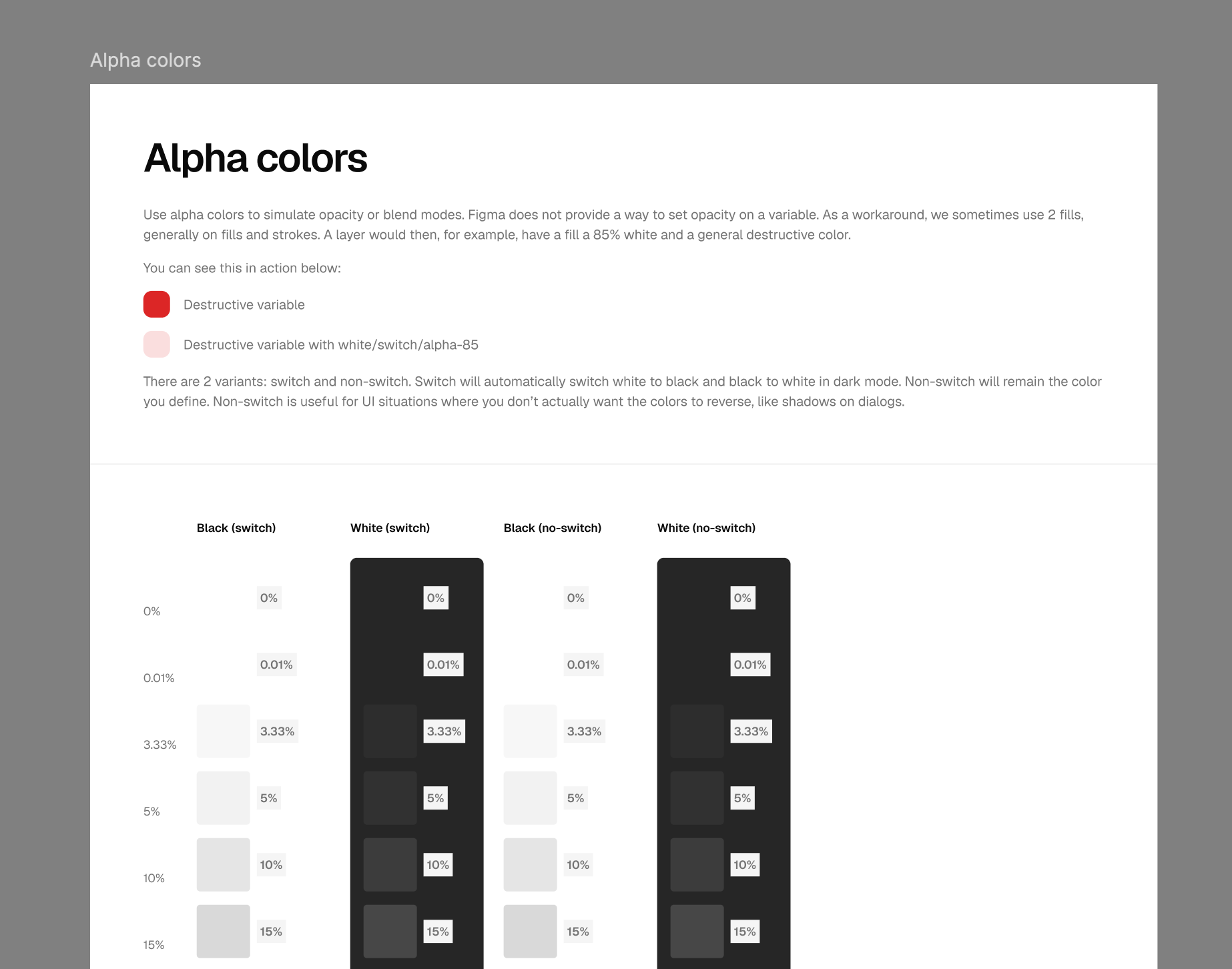
Alpha colors#
Use alpha colors to simulate opacity or blend modes. Figma does not provide a way to set opacity on a variable. As a workaround, we sometimes use 2 fills, generally on fills and strokes. A layer would then, for example, have a fill at 85% white and a general destructive color.
There are 2 variants: switch and non-switch.
- Switch automatically flips white to black and black to white in dark mode. Use it for overlays and highlights that should always read against the current background.
- Non-switch keeps the color you define, regardless of mode. This is useful for UI situations where you don’t actually want the colors to reverse — like shadows on dialogs.
Working with older kit versions#
If you’re on a kit version from 1.0.0 through 1.7.0, the colors system worked differently — see the legacy color docs for how raw colors, brand colors, unofficial variables, and the hex-to-OKLCH mapping worked before the 1.8.0 rework.