

The highest quality shadcn/ui design system for Figma and React
Obra shadcn/ui defines a design to development workflow that allows you to kickstart your brand's design system in hours instead of weeks.
A Figma kit that is easy to work with and easy to make your own
- Build your base theme in seconds, with the whole kit following your design choices
- A manageable base variables library
- All shadcn/ui components, expertly built, with correct usage of Figma component properties and slots
- Take your theme to code with the CSS Export plugin
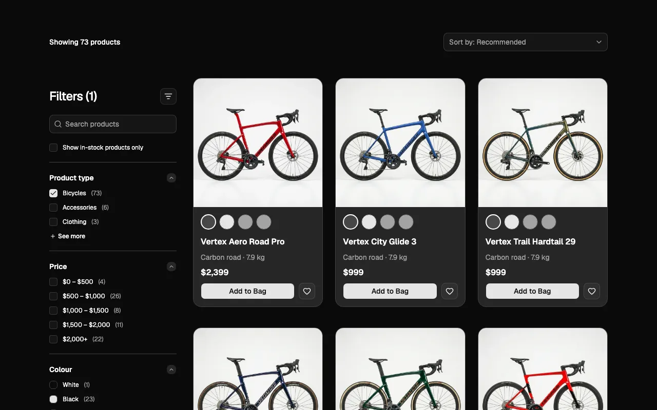
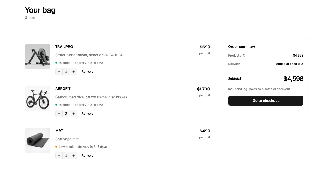
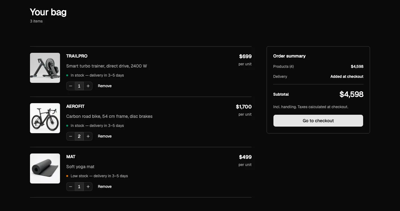
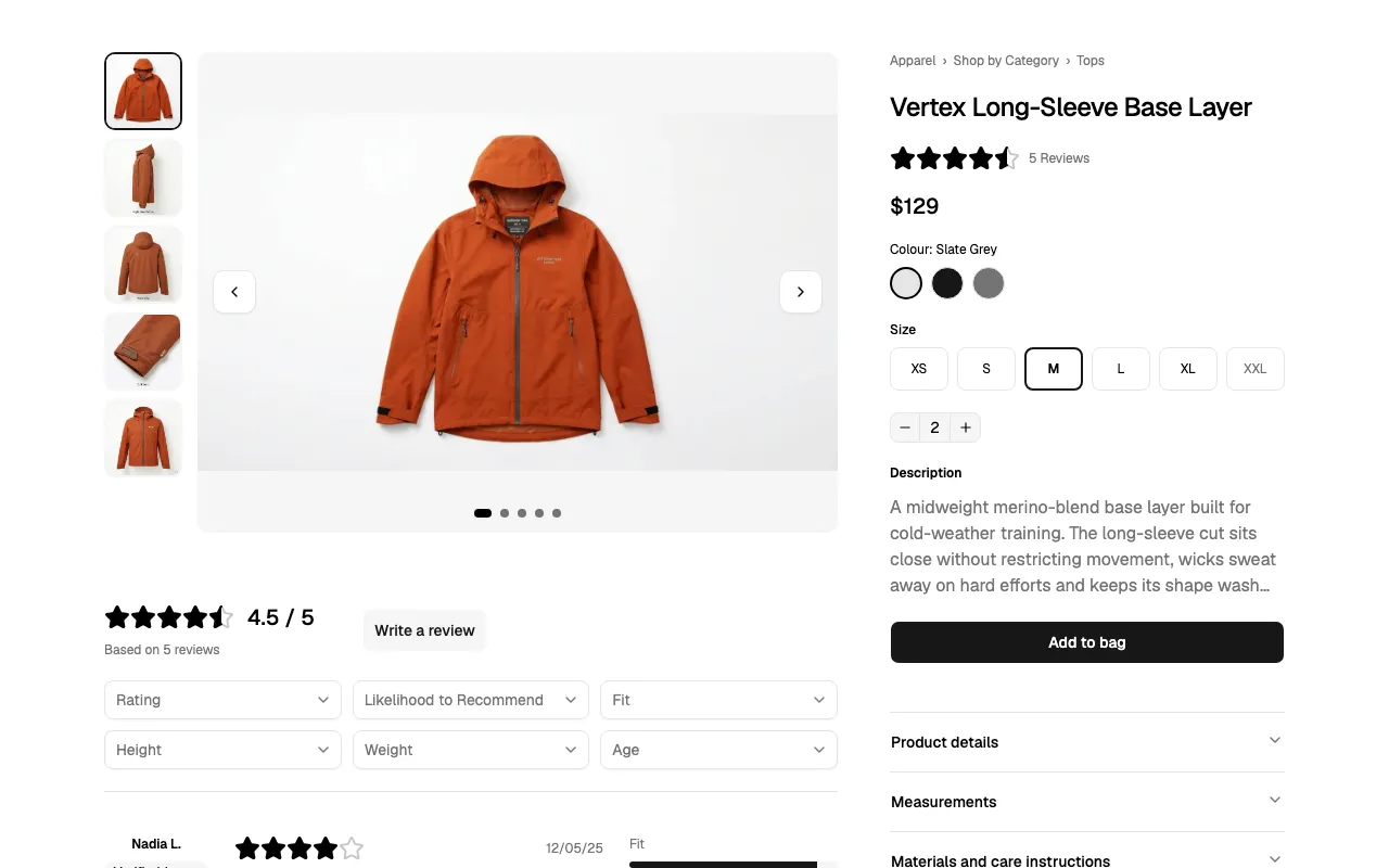
- 100+ Pro Blocks in 3 categories: marketing, e-commerce and application UI
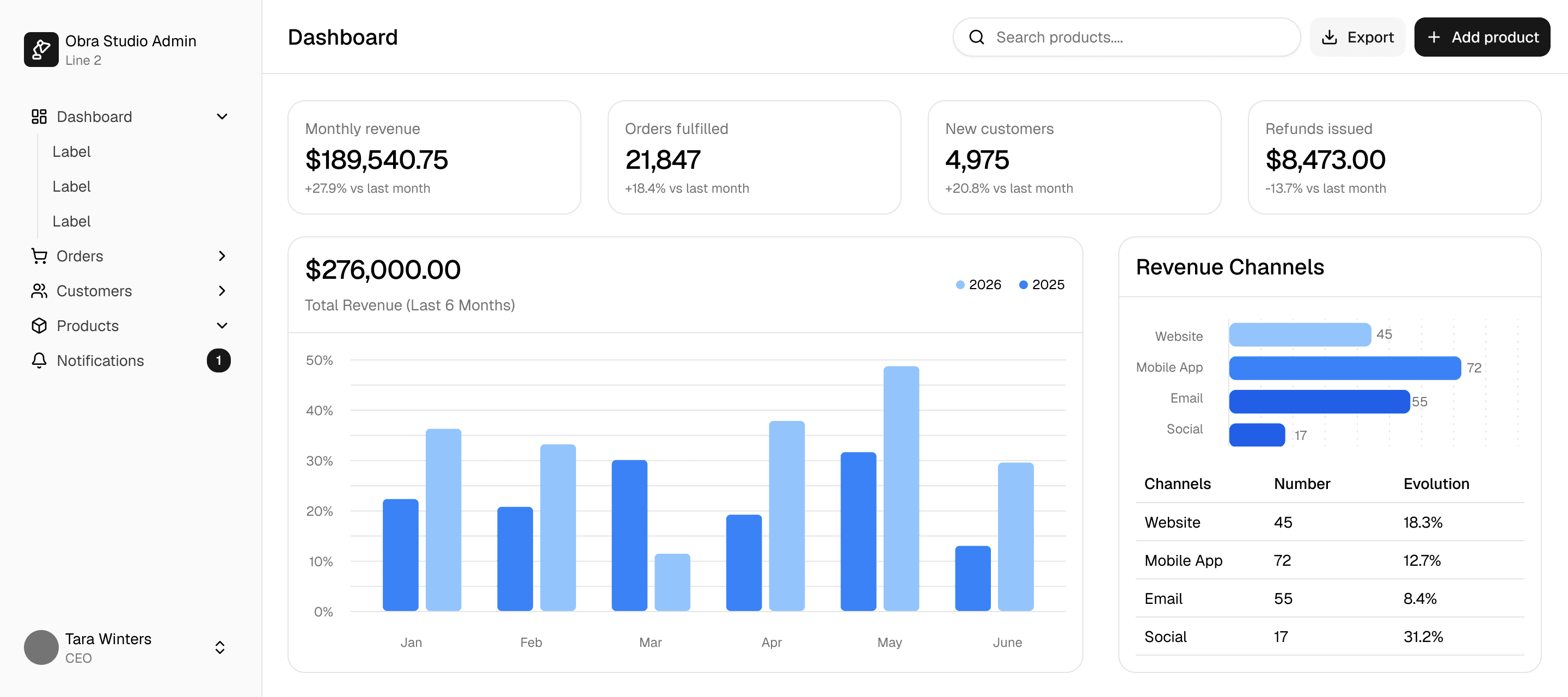
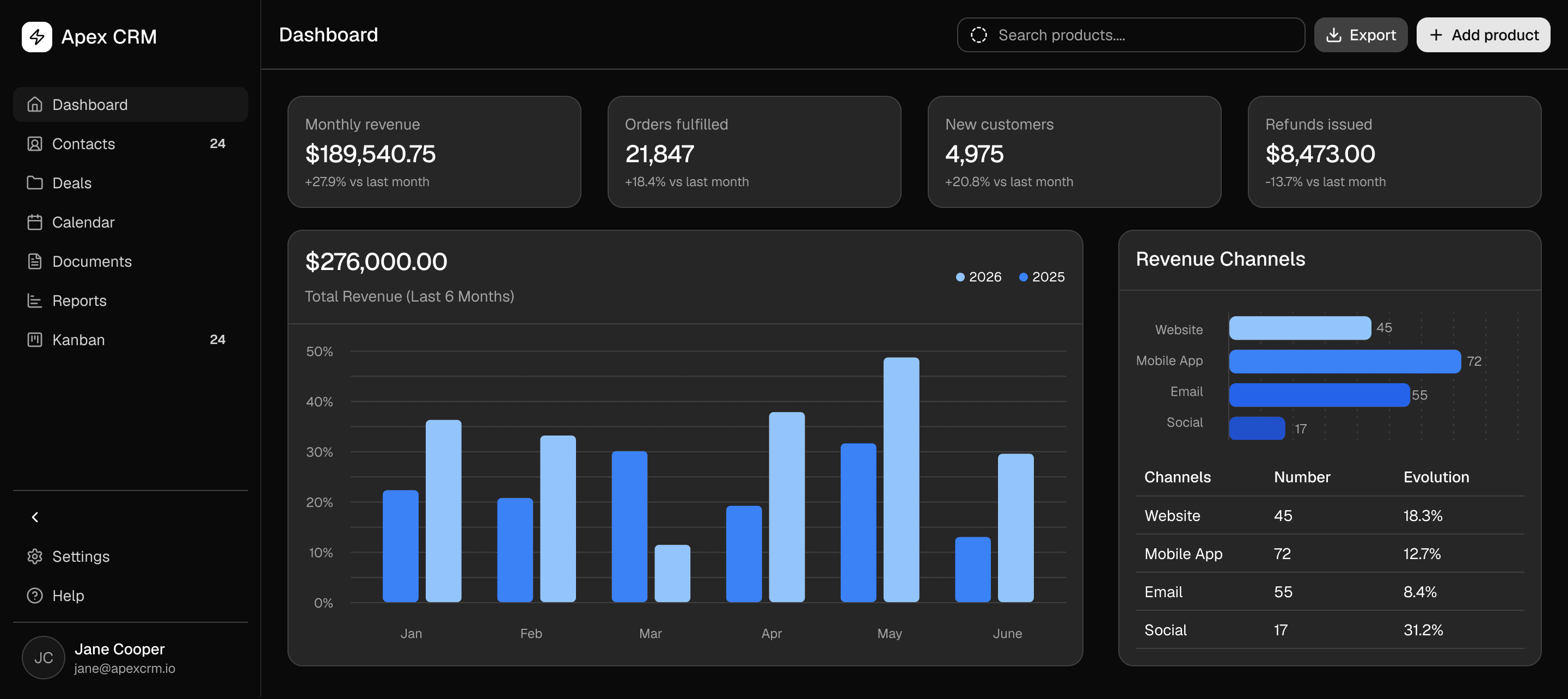
A Figma kit that is easy to work with and easy to make your own
- Build your base theme in seconds, with the whole kit following your design choices
- A manageable base variables library
- All shadcn/ui components, expertly built, with correct usage of Figma component properties and slots
- Take your theme to code with the CSS Export plugin
- 100+ Pro Blocks in 3 categories: marketing, e-commerce and application UI
The highest quality free shadcn/ui kit for Figma
This project started with our beloved Figma shadcn/ui Community kit, now duplicated over 50,000 times on Figma Community.
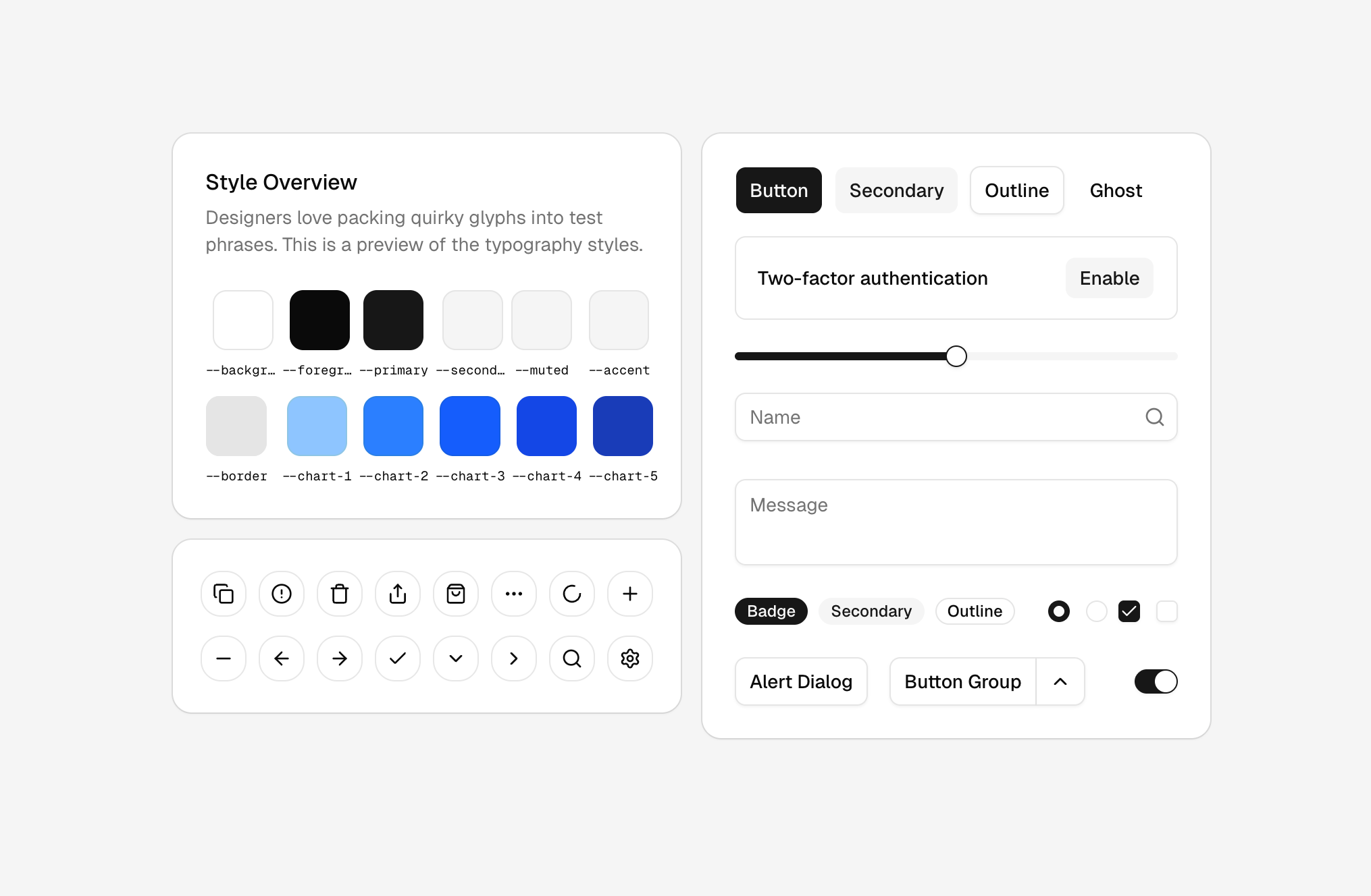
- 57 shadcn/ui components in the Nova style, light mode
- All Tailwind 4.2 colors and 1800+ Lucide icons
- Built with variables, auto layout and component properties
- Upgrade to Obra shadcn/ui Pro when you're ready: same theme and variable structure, so nothing gets lost
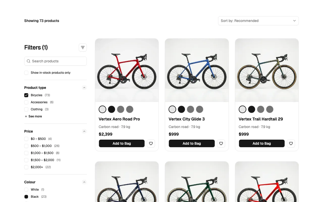
Production-ready shadcn/ui blocks, in React
100+ blocks you install with the shadcn/ui CLI.
- Marketing, e-commerce and application blocks
- Install blocks in your project easily with one terminal command
- TypeScript, responsive, and styled with your shadcn/ui tokens
- Included with every Figma Pro + React license, or available separately
Testimonials
What the community is saying
This is the highest quality kit I've found and I've evaluated more than five of them on Community. You guys really know how Figma works, it's the kit that's most in line with how I work.
Anonymous design lead, SpaceX/xAI
This is an awesome work! Thank you so much.
조세영
Thank you for the great kit!
Ali Shouman
Thanks for your amazing work!
Nicolas Fiascaro
Obra keeps coming up with these smart projects to promote themselves like the kit. But actually it is really really good, we use it in our startup project ourselves.
Valentijn Kint
News
Stay up to date
Latest blog posts
2.4.0 released - 2 new components: Trace and Code Block
October 17th, 2026
2.3.0 released — the e-commerce release
October 5th, 2026
New video: Community edition 2.0 overview
September 13th, 2026 at 19:00
Latest videos
Obra shadcn/ui - Community edition 2.0 overview
September 13, 2026
Multi brand + CSS Export + Enterprise logic for Obra shadcn/ui
August 13, 2026
Getting started with your design system for FREE in Figma using the Obra shadcn/ui kit (2026)
August 12, 2026
Newsletter
Subscribe to receive new blog posts directly in your inbox when they're published.
FAQ
This Figma kit is intended to be published as a library, after which the tokens and components would be used in another file. It can be used to create a UI design that is based on shadcn/ui.
Go to the assets panel and click the book icon to open the Manage Libraries dialog. From there, select Publish to make the file available to add as a library in other files.
In the consuming file, go to Manage Libraries as well, but now visit the Teams section. Find the published library and click add to file.
There are two editions of the Obra shadcn/ui kit.
The Community Edition is free and available on Figma Community.
The Pro Edition is a commercial edition with additional components, Pro Blocks, and dedicated support, available through Obra shadcn/ui Pro.
Follow our blog and changelog for the latest updates. You can also subscribe to our newsletter to get new posts delivered to your inbox.