1.9.4 released - Preparing for styles
- May 8th, 2026 by Johan Ronsse
We released 1.9.4. In this post, we reflect on some architectural changes we are making to prepare for supporting multiple styles.
Read more

We released 1.9.4. In this post, we reflect on some architectural changes we are making to prepare for supporting multiple styles.
Read moreA step-by-step guide for frontend developers who received a design based on the Obra shadcn/ui kit and need to set up their project with the right styling.
Read moreThree things in one post: the April launch discount ends April 30, Figma finally approved our CSS Export plugin, and 1.9.3 is out with a cleaner component architecture.
Read moreWe removed some weaker Pro Blocks in 1.9.0 and are now adding higher-quality ones in 1.9.2. That trend will continue. Plus: a look at what's next. React Pro Blocks shipping May 11.
Read moreWe realigned the kit with current shadcn/ui documentation, kept Vega as our default style, and are exploring how to switch styles inside Figma.
Read moreA detailed breakdown of what's included in the free Community Edition and what the Pro edition adds — components, blocks, plugins, and more.
Read moreTimeline and Menubar components, border radii aligned with shadcn defaults, a translucent Menu style, and Label back among the official components.
Read more1.8.2 simplifies dark mode to a single toggle, and while we wait for Figma to approve the CSS Export plugin, license holders can grab it from the download center and run it locally.
Read moreA small follow-up to 1.8.0 — corrects default variable colors for primary and foreground.
Read more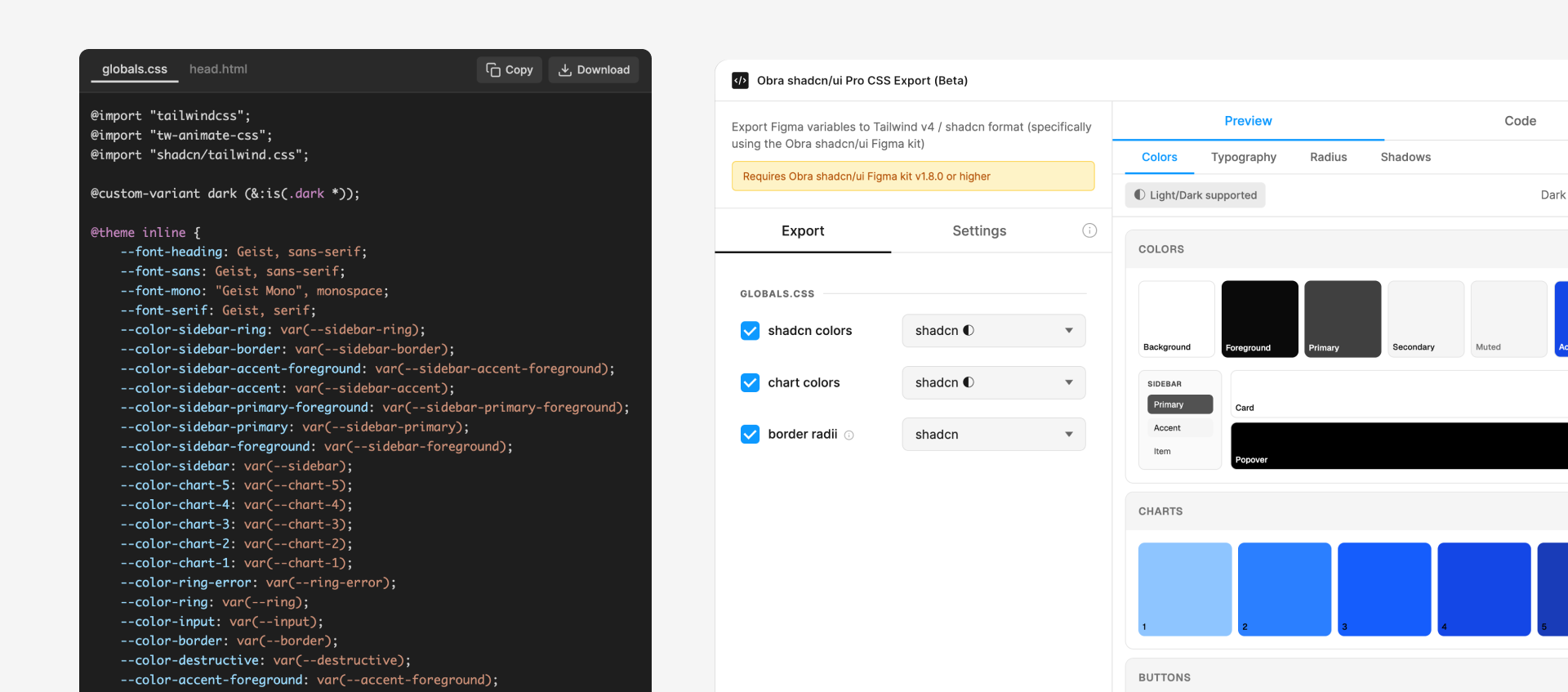
CSS Export plugin, closer alignment with shadcn/ui variables, fresh Tailwind colors, Lucide 1.0 icons, and improved components.
Read more