

Developer tutorial: from design to dev
You’re a frontend developer. You’ve received a design based on the Obra shadcn/ui Pro kit. Here’s how to set up your project and pull the styling out of Figma.
Before you begin, check the version of the Figma file. Open the Changelog page in the file and confirm the version is 1.8.0 (April 10, 2026) or higher — the plugin requires it.
Step 1: Set up your project with shadcn/ui Create#
The fastest way to match the kit is to use our preset on shadcn/ui Create: click Open preset and paste b1Z5aAiW0. It sets the Vega style, Neutral base/theme, Geist, Lucide, and the other defaults the kit ships with, so you don’t have to pick each option by hand.
This tutorial assumes Next.js. If you use another framework, some path or CSS file names may differ.
If you know your project diverges from the defaults — for example, the base color was changed to Stone — tweak that one setting after applying the preset. When in doubt, ask your designer.
Step 2: Initialize your project#
npx shadcn@latest init --preset b1Z5aAiW0 --base base --template nextRun the dev server:
npm run devBring in the demo via a CLI command. This adds a demo page and 17 components:
npx shadcn@latest add demoYou can see which components in the output:
npx shadcn@latest add demo --overwrite
✔ Checking registry.
✔ Created 17 files:
  - components/ui/badge.tsx
  - components/ui/button.tsx
  - components/ui/separator.tsx
  - components/ui/card.tsx
  - components/ui/checkbox.tsx
  - components/ui/dropdown-menu.tsx
  - components/ui/label.tsx
  - components/ui/input.tsx
  - components/ui/textarea.tsx
  - components/ui/radio-group.tsx
  - components/ui/slider.tsx
  - components/ui/switch.tsx
  - components/ui/alert-dialog.tsx
  - components/ui/button-group.tsx
  - components/ui/item.tsx
  - components/ui/field.tsx
  - components/ui/input-group.tsx
  - components/demo.tsx
Add the demo import to a page you can visit, e.g. page.tsx in Next.js projects:
import { Demo } from '@/components/demo'And then make it visible:
export default function Page() {
return (
<Demo />
)
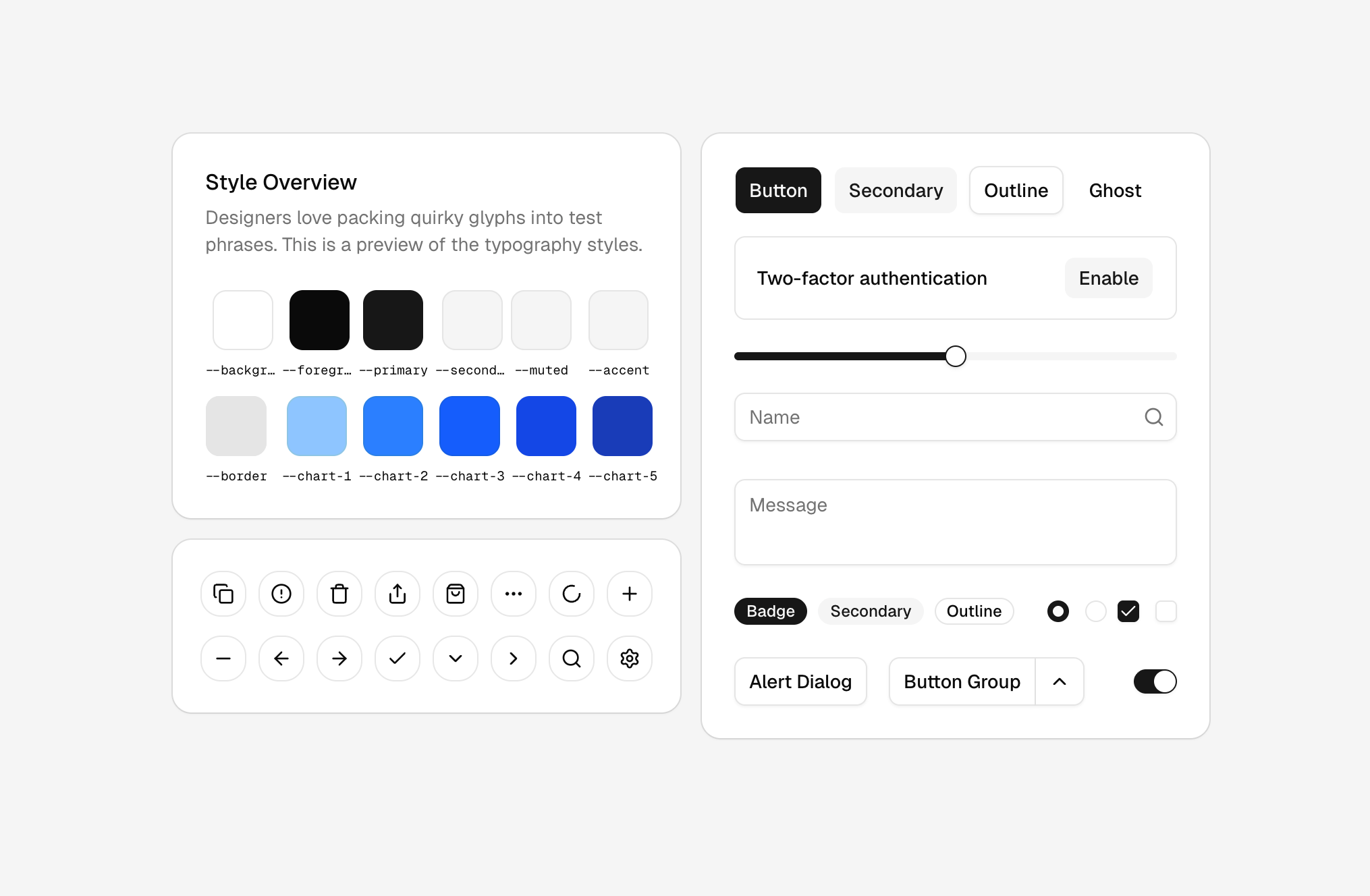
}You should see this:
Step 3: Run the CSS Export plugin against your file#
At this point we assume you’ve changed the variables in your Figma file.
If you’re testing this workflow without any changes made yet, we recommend changing the color of the primary variable and your font.
You can do this by adjusting the primary token in the shadcn colors collection. Then change font-family in the typography collection to a font of your choice.
Run the plugin and copy the globals CSS from the Code tab into your project’s globals.css.
You’ll see the colors change to the colors defined in your Figma variables.
Step 4 (optional): Output type styles#
The plugin can also output your type styles to your project.
It creates a Tailwind v4 @utility class per default type style (heading 1–4 and the different paragraph sizes).
On the main page of the plugin, turn on the Obra extended option. You’ll now see typography styles output in your globals.css.
If your project doesn’t use Tailwind v4, the Settings tab has an option to emit the type styles as plain .text-… CSS classes instead of @utility blocks.