

Obra shadcn/ui 2.0: All shadcn styles, Chat components, updated Community file

August 10th, 2026
With our design and development team. we’ve cooked up our biggest release yet over the past few months! Let’s take a look at what is new.
Support for all 8 shadcn/ui styles (Pro only)#
We already supported the Nova, Vega, Rhea and Luma styles. This release brings support for the 4 remaining shadcn/ui to styles to our Figma kit: Mira, Maia, Sera and Lyra.
The Community file supports Nova only. When purchasing Obra shadcn/ui Pro, all styles are available as a separate Figma file.
Architecturally, we choose to maintain separate Figma files, as we believe this leads to files that are easier to edit and a better user experience for designers.
New Chat and Questionnaire components#
We’ve added these six new components to our Figma kit, for both Pro and Community.
There’s the 5 new chat-related components Attachment, Bubble, Message, Message Scroller and Marker. We also added Questionnaire, which was released just last week.
The Chat components help to create chat interfaces. The marker component specifically is a component that typically denotes LLM activity (e.g. “Thinking…”).
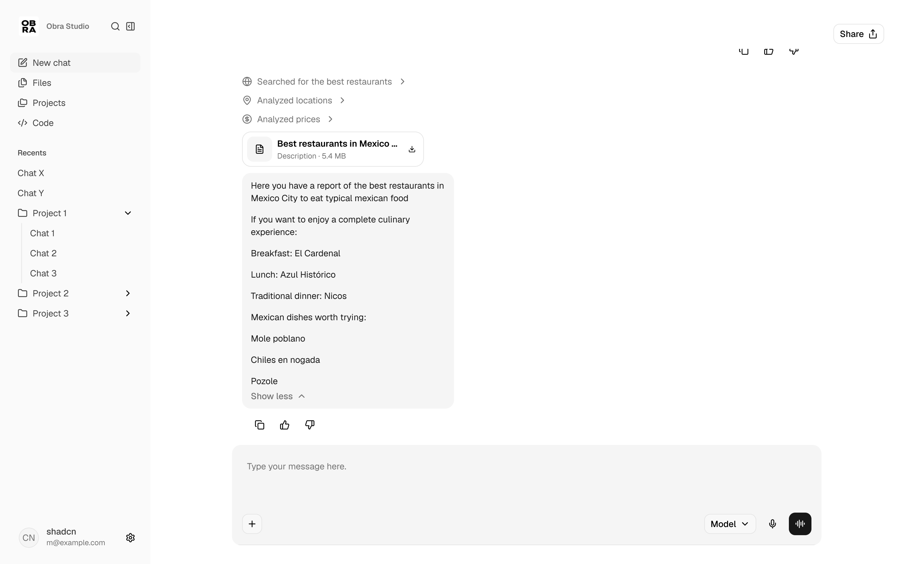
The Questionnaire component allows you to build interactive UIs and can be used to make Typeform-style forms with shortcuts, or remixed with the Chat components to create interactive LLM-based UIs (where the LLM presents you with strategical choices).
Simplified variables setup + Variable count reduced#
We keep our variable count small, so that files are understandable and easy to edit. We refactored the variables in all of our Figma kits for a 20% reduction in variable count.
We also took the opportunity that a new major version number gives to rethink our first-time setup. Theming is now more straightforward. The first collection you encounter is called “theme”. where you can instantly change both the neutrals, destructive color and chart colors in 1 go (you can also do this in a visual way with our shadcn/ui create plugin).
If you need to go deeper on colors, the next collection “shadcn colors” allows you to do so. For many use cases, changing the base colors and typography brings you to a customized Figma kit in under 10 minutes of work.
Updated 2.0 Community file#
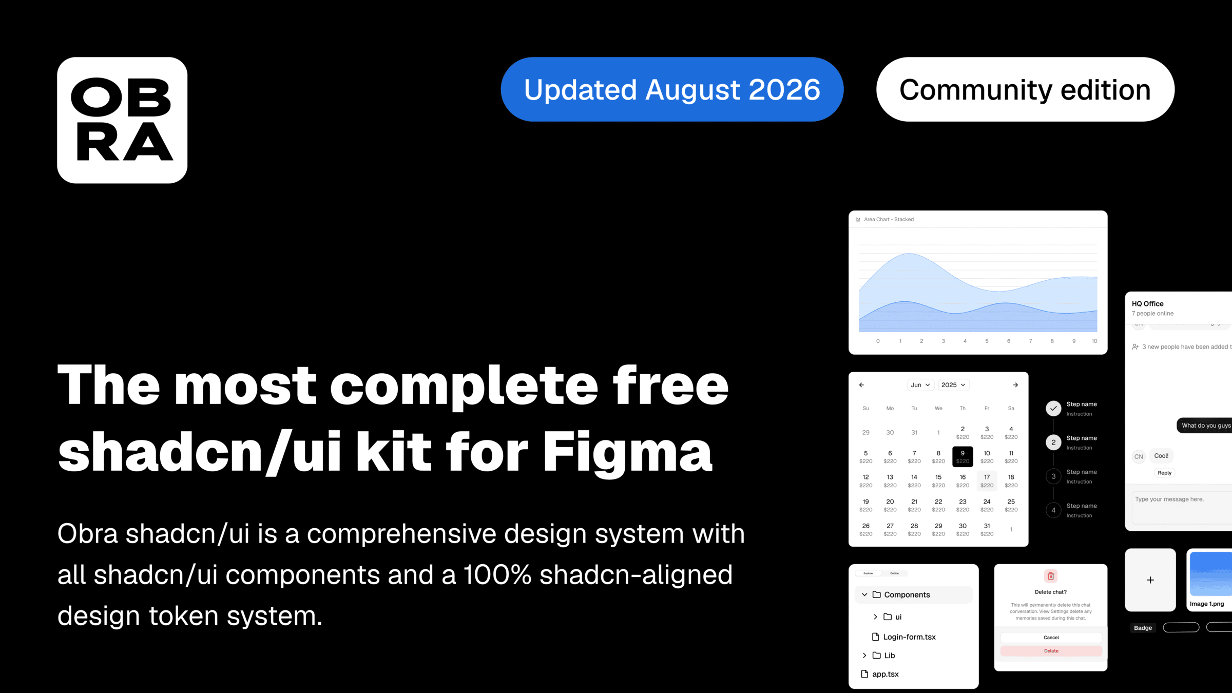
The community file has not received a lot of attention over the past few months. We’ve decided to completely revamp the Community file to carry over the changes that we made to Pro. Customers have been asking for an upgrade path between the free Community edition and Pro. The change we made means that you can get started with Community, and then upgrade to Pro in a realistic manner.
We changed the default style to Nova, since that’s what the shadcn docs have been defaulting to for a long while now. The Community file contains all shadcn/ui components.
Check out the file on Figma Community →
Updated CSS Export and Create plugins#
In the process of creating this release, we’ve also updated our Obra CSS export, Obra Shadcn/ui create and various helper plugins to support the new changes.
For the CSS Export 2.0 plugin, we rethought the scope of what the plugin should cover and removed some experimental features that were confusing to users. We added the ability to generate CSS for custom type styles.
For our Obra shadcn/ui Create plugin, we reworked the user interface to align with Figma’s UI3. You will see more of our plugins align with Figma’s user interface over time.
Discount of 20% for August#
To celebrate the new release, we are offering a discount of 20%. Use code TWOPOINTZERO to receive a 20% discount upon checkout. This offer runs until the end of August.