

Obra shadcn/ui Pro 1.8.0 released

April 10th, 2026
The Obra shadcn/ui kit just got a major update. Here’s the main updates:
- CSS Export Plugin — The new Pro CSS Export plugin outputs shadcn/ui-compatible CSS directly from your Figma variables. Sync styles with your development project? One copy-paste away.
- Closer to shadcn/ui than ever — We deeply reworked the color collections in our kit to remove unofficial variables and match what shadcn/ui uses in code. This helps designers and devs work together more smoothly, since they’re now speaking the same language.
- Better slot usage in components — We improved Figma slots usage across 15+ components
- Improved colors and icons — Taupe, Mauve, Mist, and Olive are in — the new Tailwind colors added in February are now part of the kit. We also upgraded to Lucide 1.0, plus brand icons via Obra Icons — since Lucide removed brand icons. Now defaulting to a 2px stroke.
Existing customers can use the download center (see instructions in your purchase e-mail) to get the latest version.
CSS export#
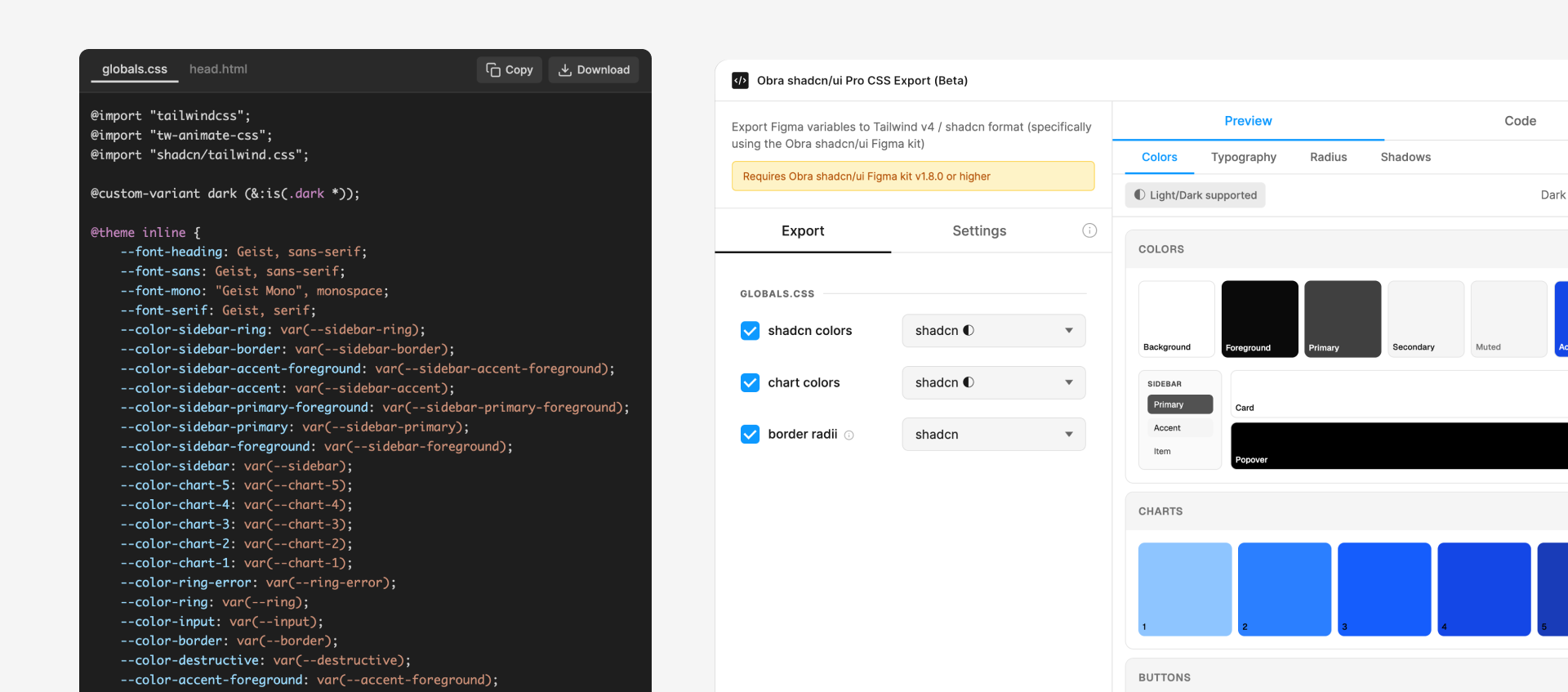
The headline feature of 1.8.0 is our new CSS export plugin. It lets you export a CSS file straight from your Figma kit, ready to paste into a shadcn/ui project.
The plugin reads the standard variable collections shipped with the kit, so any customization you make in colors and typography comes through in the output.
It also detects fonts from Google Fonts and gives you the matching <link> tags to drop into your <head>.
Get the plugin#
Heads up: Our Obra shadcn/ui Pro CSS Export (Beta) plugin is currently under review by the Figma team. We will update this blog post with the community link when the review is done.
Organisation and Enterprise license holders can request the plugin source code via our contact form and customize it for their own needs.
A cleaner, shadcn-aligned variable system#
To make the CSS export reliable, we did a deep pass on the kit’s variable system. All “unofficial” variables — extras we’d added over time that didn’t exist in shadcn/ui itself — are gone. What remains maps one-to-one to the variables shadcn/ui actually uses in code.
The practical benefit of this is less friction in design–dev handoff. Designers and developers are now looking at the same names, the same scales, and the same semantics. No more “what’s this custom thing?” conversations.
We’ve also updated the color docs to reflect the simpler system, with the legacy variable information tucked into collapsible sections so older kit users can still find it.
For the full changelog, see the changelog page.
Current discount#
The 50% off April launch discount is still active.
Every month, we’re adding more value to our kit. This month, we do it through our exact alignment with shadcn and the related design to code plugin.
Next month, we’re releasing React versions of our Pro Blocks. In June, we’re releasing a series of videos to learn how to work with the kit efficiently.
Use code LAUNCHAPRIL at checkout to lock in your discount now, and get access to future upgrades.