

1.8.0 preview

March 27th, 2026
Hi everyone, I am excited to announce that we have sold the kit over 50 times.
The loop that I was talking about on this blog about getting revenue from the kit and then putting it back into the quality of the kit is starting to happen, and I am super excited about that.
Last chance to buy with the best launch discount#
By the way, these are the last days of March - this is your chance to lock into the Obra shadcn/ui kit for the lowest price, with the 75% discount. Use code LAUNCHMARCH on checkout (the discount code field is at the very bottom).
You’ll get the Pro edition of the kit, and any future upgrades. Check out our roadmap.
What’s coming#
1.8.0 will be released on April 11. A snapshot of the current 1.8.0 file will be made available on March 31 upon request for early adopter customers. Contact us at [email protected].
This blog post is a preview of what’s coming.
General improvements#
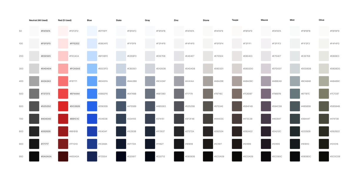
New colors — and old colors. shadcn removed slate and gray from ”create” but we are keeping this in the kit. Many designers like to use slate.
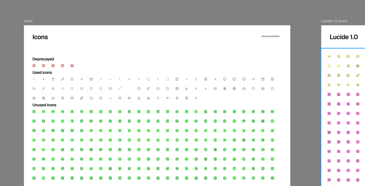
Process shot of switching to Lucide at 2px instead of 1.5 - a better default, we think. Thanks for the feedback, Frank G.
We’ve enlisted the Obra team to start working on several aspects, including:
- Components/slots related: We already use slots for the majority of components that could use them, but want to go further. We are working on updates to several components, including Empty and Item components to make them use slots in the best way possible, and considering where we can use slots efficiently.
- Colors: Improving the Tailwind colors to use the 4.2 colors
- Icons: Lucide also released a 1.0 version of their icon set, which we are implementing with 2 pixel strokes as a default (specific feedback from a user of the kit)
- Bringing back the official shadcn/ui examples: Examples like Dashboard, Tasks, Playground, Authentication and what you see when you go to ”create“.
Roadmap item: Design to dev#
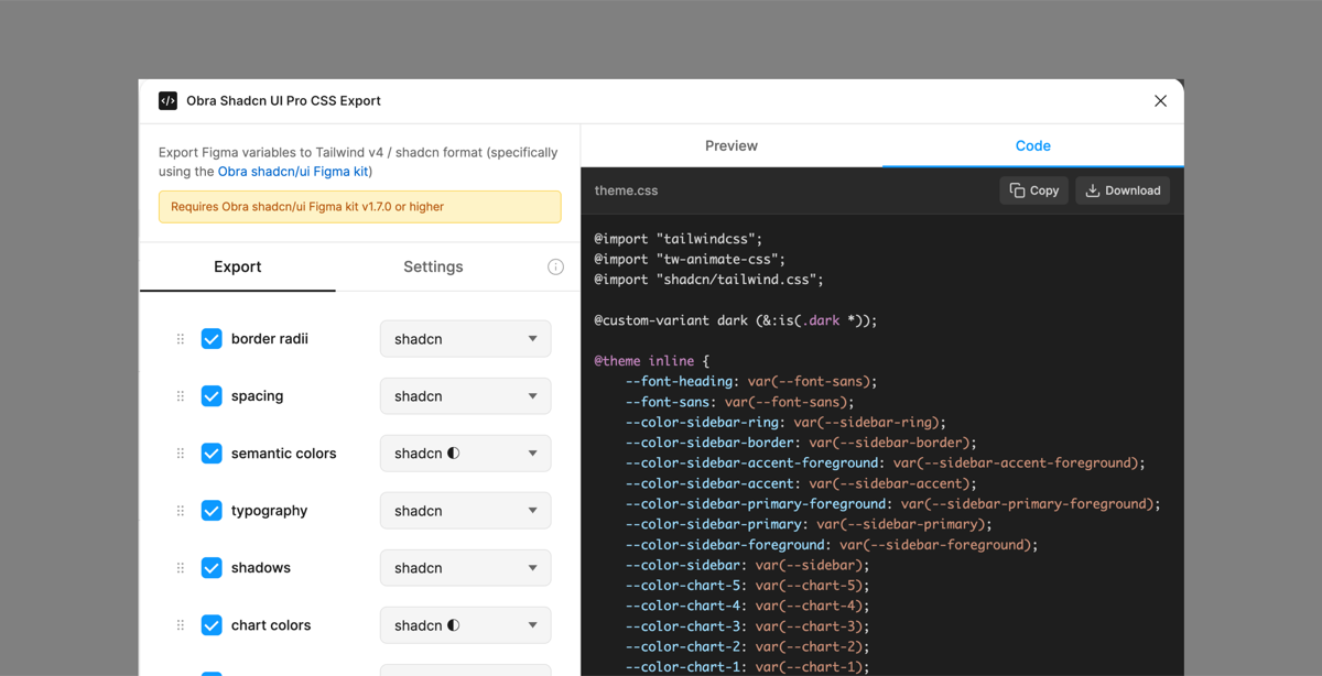
Current state of the design to dev plugin.
We are also working on improving design to dev workflows. We used to have a CSS export plugin that was promising but never got the attention it deserved.
With the kit going commercial and being a success so far, we can finally divert our time to this.
Diving into the CSS export makes it clear that some slight changes will have to be made on the variables front to align to shadcn/ui.
Some unofficial variables like destructive_foreground or destructive_text were created with the best of intentions but ultimately are in the way of teams starting out. Sticking to official shadcn variables makes our kit slightly uglier but helps design to dev workflows.
If you are using our kit in a design to dev situation, we would love to have a call about it and see if we can help with any specifics. This will help match our solution with real-world needs. Feel free to book a call.
Conclusions#
With the product selling well, energy levels are high to put more dedicated work into it.
We have a great product on our hands and we’re excited to make this kit better.
We’d like to repeat our call for feedback from our last blog post. If you have anything - it can be the slightest detail - that bothers you about the kit, let us know. You can use the contact form here which also supports attachments.
Let’s go!