

1.4.0 released

January 14th, 2026
With Obra Studio we’ve helped clients across the world customize our very own shadcn/ui kit. Client projects keep our kit free and open source. They also lead to improvements needed by real-world design teams, available for everyone.
Read our offering around kit customization on our website →.
Check out our Obra shadcn/ui CSS export plugin to automatically export your variable theme to a shadcn/ui theme!
We’ve released the 1.4.0 version of the Obra shadcn/ui kit. As always, grab the kit on the Figma community page. This release comes with a lot of improvements and bug fixes. Check out the changelog for all details.
Main features#
Here are the general improvements:
- Improved white labeling workflow (aka multi-theme workflow)
- Improved design to development workflow with a custom, open source plugin
- Improved several components to be more robust including Item, Empty State, Input Group (complete the October ‘25 drop)
Bugfix of note: destructive foreground#
A bugfix of note is a change to the destructive foreground variable; check out the changelog for all details.
Regressions#
Regarding icons, we now ship without the icon hack and rely on outlined icons. This change caused some debate in our team, but we think simplifying the layer structure is more beneficial than making it harder on everyone to maintain the kit.
Improved theming in general#
We’ve heard that our kit didn’t go far enough when it came to variables usage. With the new variables structure, you can go much further without needing to go custom.
- The typography part has received a major overhaul. You can now adjust the typography and specific heading and paragraph styles by only adjusting variables. This ties into the white-labeling improvements (see below)
- The new spacing structure allows you to make a spacious or compact theme with much more ease than before, as we examined every component to fully rely on auto layout and tokenized spacings
- The new logic for border radii makes it very easy to customize border radii to a fully square or more rounded theme than before.
- By separating out the chart themes from the regular color themes, it is easier to provide support for several chart themes that are independent of the color theme.
We find that the general structure of collections (once again, see below - the section on white-labeling improvments) also helps to have an experimentation layer where you can try out design variations without duplicating an entire single theme and having to maintain hundred of copied variables.
Improved white labeling workflow (aka multi-theme workflow)#
In this release, we’ve re-evaluated the theming layer to provide better support for custom theming in general and more specifically for white-labeling. This will greatly help teams that manage multiple themes in a single Figma library.
The biggest change in the theming layer is doubling down on working with different collections. The different collections are:
- Colors
- Typography
- Border radii
- Spacing
- Chart colors
- Shadows
The spacing and border radii collections now use t-shirt sized variables (e.g. rounded-sm) by default. The fixed values are hidden away in 2 collections that do not get published by default.
Working with so many modes might feel awkward at first, but it enables a word of possibilities when it comes to white-labeling themes — without needing any of Figma’s enterprise features like extended collections or API variable import (also locked to the enterprise tier).
(Check out our batch mode switcher plugin to apply several modes at once)
Watch the demo video for this feature:
Improved design to development workflow#
As a team, we pinned our hopes on Figma’s export to JSON features, but when that feature released, it felt inadequate for our needs.
When exporting variables via Figma’s native export, first of all there is no automated way to do this, and second of all, you end up with a bunch of JSON files in the design tokens 1.0 spec.
This output now requires further processing. It might be OK for some teams to build a whole dev pipeline around that when they can pull in the changes via the Enterprise API, but this doesn’t work for most teams.
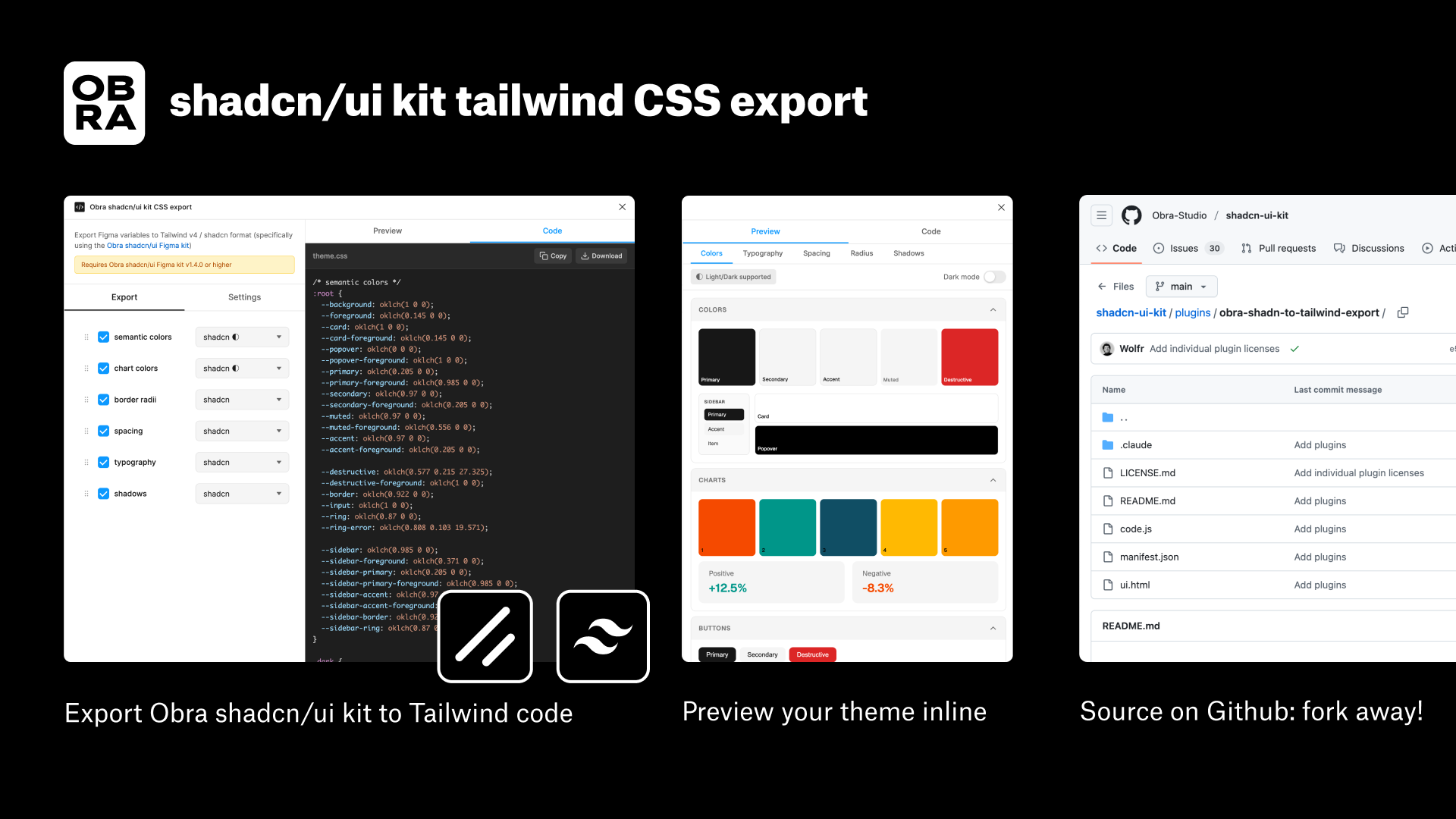
What we did instead to solve design to development is build a plugin that takes your variables and directly translates it to a shadcn theme, as well as Tailwind theme code. You can find our Obra shadcn/ui kit CSS export plugin on Figma community.
This plugin is fully open source to teams can customize it to their needs. Do you have a specific set of variables that need to land in code? Fork away! The plugin, just like our shadcn/ui kit, is released under a very permissive MIT license. You can find the code in our shadcn/ui-kit repository here.
Update: we decided to remove (free) support for this plugin as it ties into our commercial offering.
Watch the demo video for this feature:
Final words#
With the changes in this release, we are stabilizing the theming layer for others to build on.
Unless we get very specific feedback, do not expect any major changes in this layer anymore. This is the kit release to start building your design system with in 2026.
And if you need any help with that, we’re always available for questions or consulting with Obra Studio.
Read our offering around kit customization on our website →.