

Our stance on shadcn/ui create

February 6th, 2026
Some community members have asked us what our stance is on “create”. In this blog post, we discuss our opinion and how it affects our kit.
In December, the shadcn/ui website was updated with a feature to “create your own shadcn/ui theme” called Create.
Create essentially allows you to customize aspects of shadcn/ui on the shadcn/ui website itself to generate a theme.
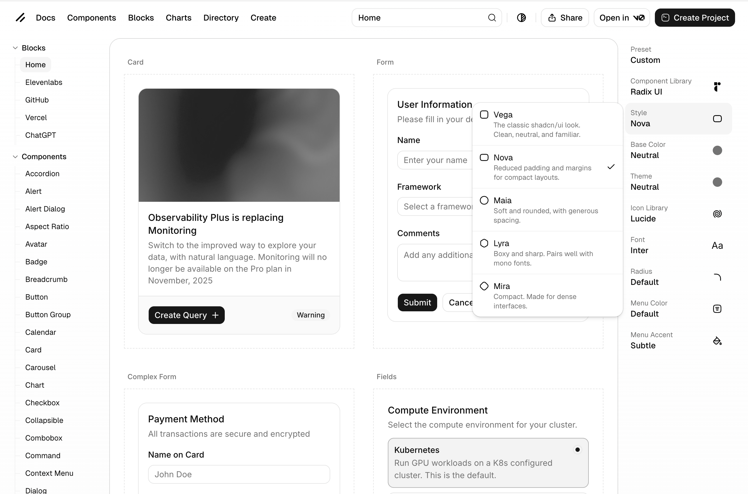
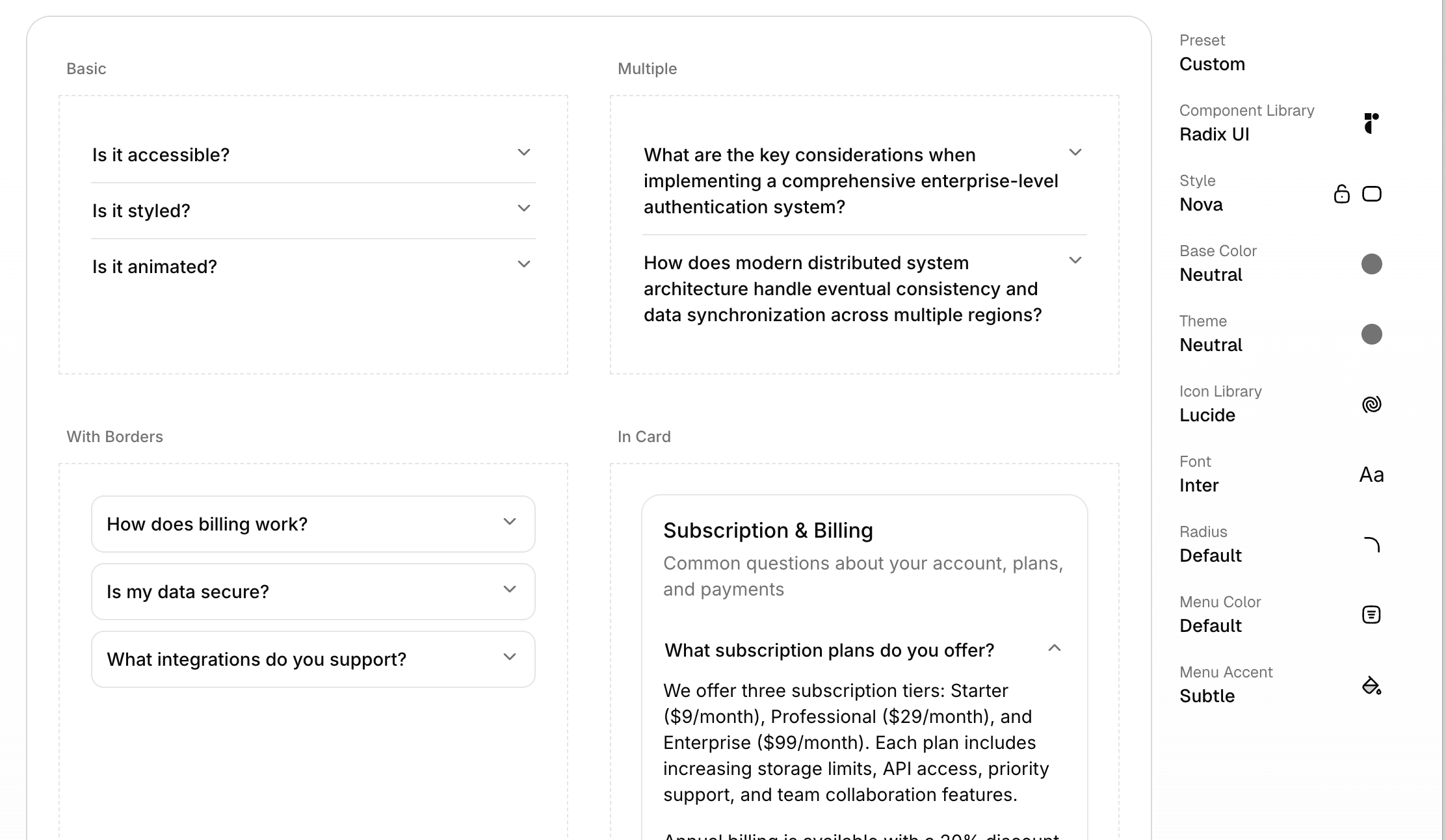
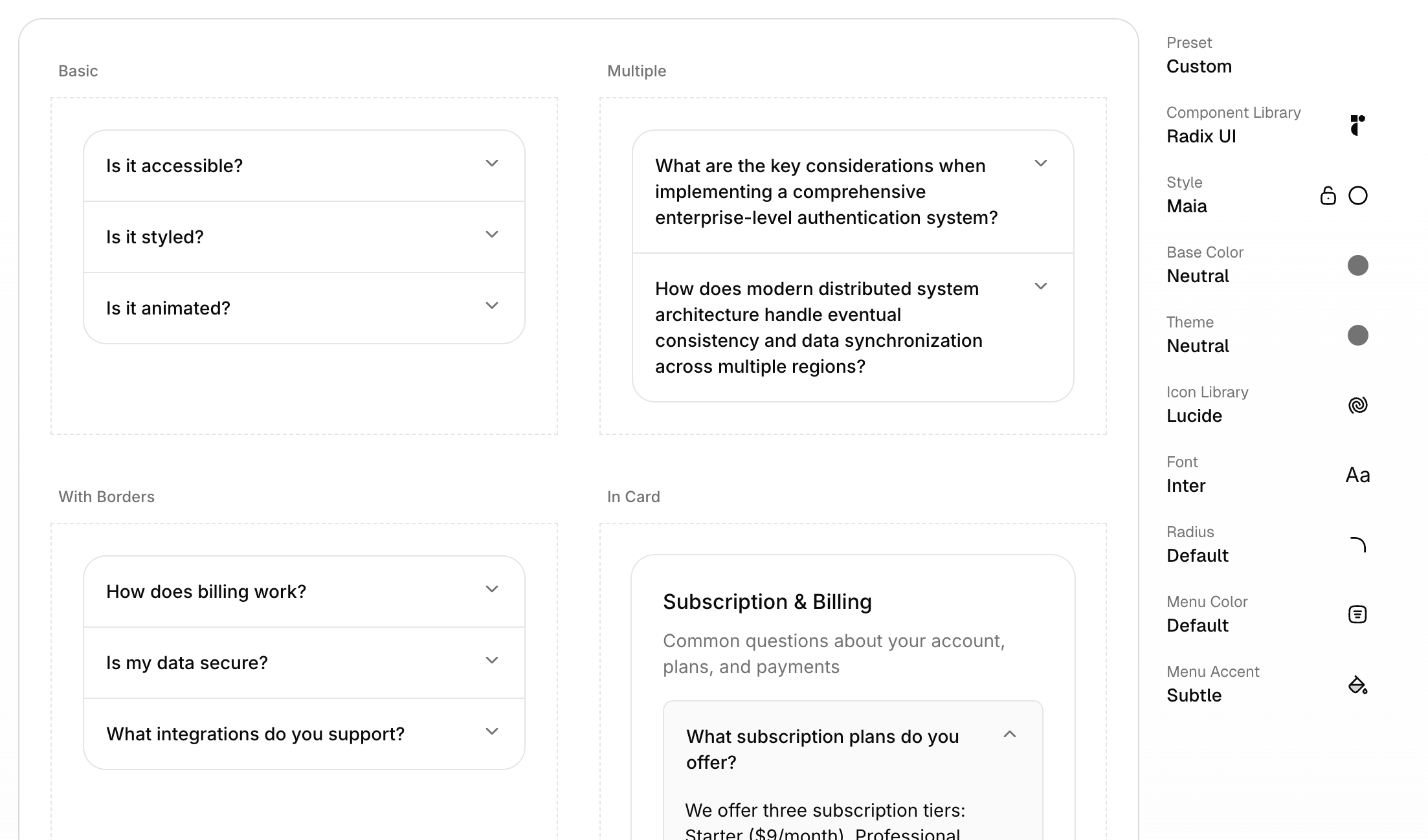
When you start creating a theme, you’d select any of the 5 styles: Vega, Nova, Maia, Lyra and Mira.
Vega is the classic shadcn look, and the one that, in our opinion, works best for most use cases.
Right now, Nova is the style that shows up by default when browsing components on ui.shadcn.com.
Vega is what we use in our kit.
Choosing a style affect multiple things at once:
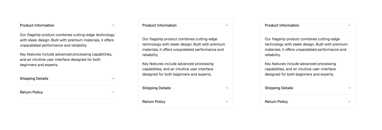
- Spacing - How much spacing is used
- Border radii - How generous border radii are
- Whether a box or table-view style is used for lists (Works in Maia and Mira)
- Whether a pill-shaped input control is used for inputs yes or no (Maia only)
To continue customizing, you would choose any of 4 base colors (neutral, stone, zinc and gray) and then use a theme color.
You are also able to choose a font with 13 default choices.
There are more features, like customizing the icon set. You can choose between Lucide, Phospor Icons, Tabler Icons, Remix icons and HugeIcons.
In our customization work we have found the “old” default of Lucide Icons to sometimes not be the best choice. Mostly because Lucide Icons does not include filled icons. We really like Tabler and Phosphor icons and of course, our very own Obra Icons.
We think it’s great that anyone can create a shadcn/ui theme — and that with little effort, any shadcn/ui-powered UI can look better.
But of course, with our team mostly being a team of designers, we find these customizations a bit basic. We customize shadcn/ui as a service so naturally we have opinions about this.
How does “create” affect the Obra shadcn/ui kit?#
Before “create” there was 1 shadcn/ui look, and we could promise pixel parity with the shadcn/ui docs.
One of the advantages we listed was “Recreates all shadcn/ui components accurately”. Now we have to add a little asterisk note: accurately - Vega style.
Things are not so clear cut anymore:
- The Nova look is the default in shadcn/ui documentation
- We built our kit on the Vega look
- You can reach the Nova look via customizing our variables
- Yet, we think the Vega look is a better default for most teams.
We’ve discussed the change within our internal team, and what to do about it.
There is no 1:1 relationship between a change to a development framework and what should happen in the UI kit.
We’ve seen some competing kits rush to create plugins to cover this use case, but we think this is the wrong approach. The approach of swapping styles will only ever work on a fresh copy of a kit and is bound to break fast in the real world.
It looks good in a demo, but it won’t work.
We’ve thought long and hard about this, and the thing is that all of the customizations you can make in shadcn/ui create, you can also recreate in our Figma kit.
- Changing the font: go to typography variables and make the change. See typography.
- Colors: go to the color variables and make the change. Remap to any of the Tailwind colors or choose your own. See colors.
- Changing the icon set: check out our icon sets community file. Replace all icons after the blank icon and work from there.
- Changing the spacing: every spacing value in our kit (even the weird ones) is tied to a variable. You can make the kit appear more or less spacious by changing the overall scale in the top-level variable group for this.
- Changing the border radii: every border radius value in our kit is tied to a variable as well. You can make a squared look in seconds by changing every value (except infinity, better not touch that one). Or change the overall values of border radii by tweaking the values in the variable panel.
For stylistic changes on the component level, we don’t think it makes sense to have to choose between one style or the other.
We simply have both available in the kit. This then allows designers to experiment with what is right for their project.
Consider an accordion;
In our kit, we provide both variants for accordions: bordered and unbordered (and bordered with no middle borders as an option)
Consider inputs. We provide both variants for inputs: regular and round.
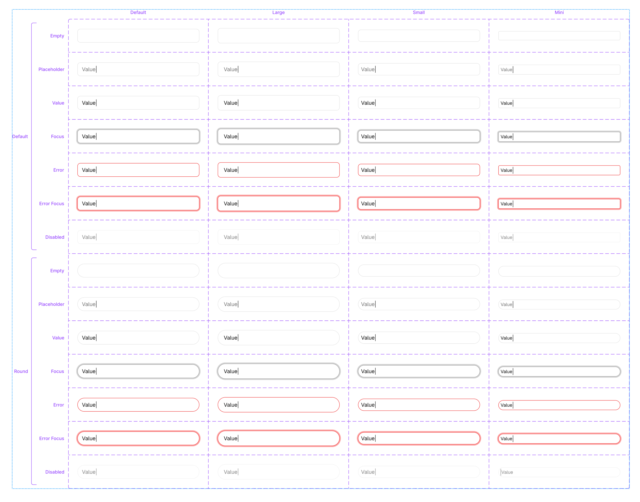
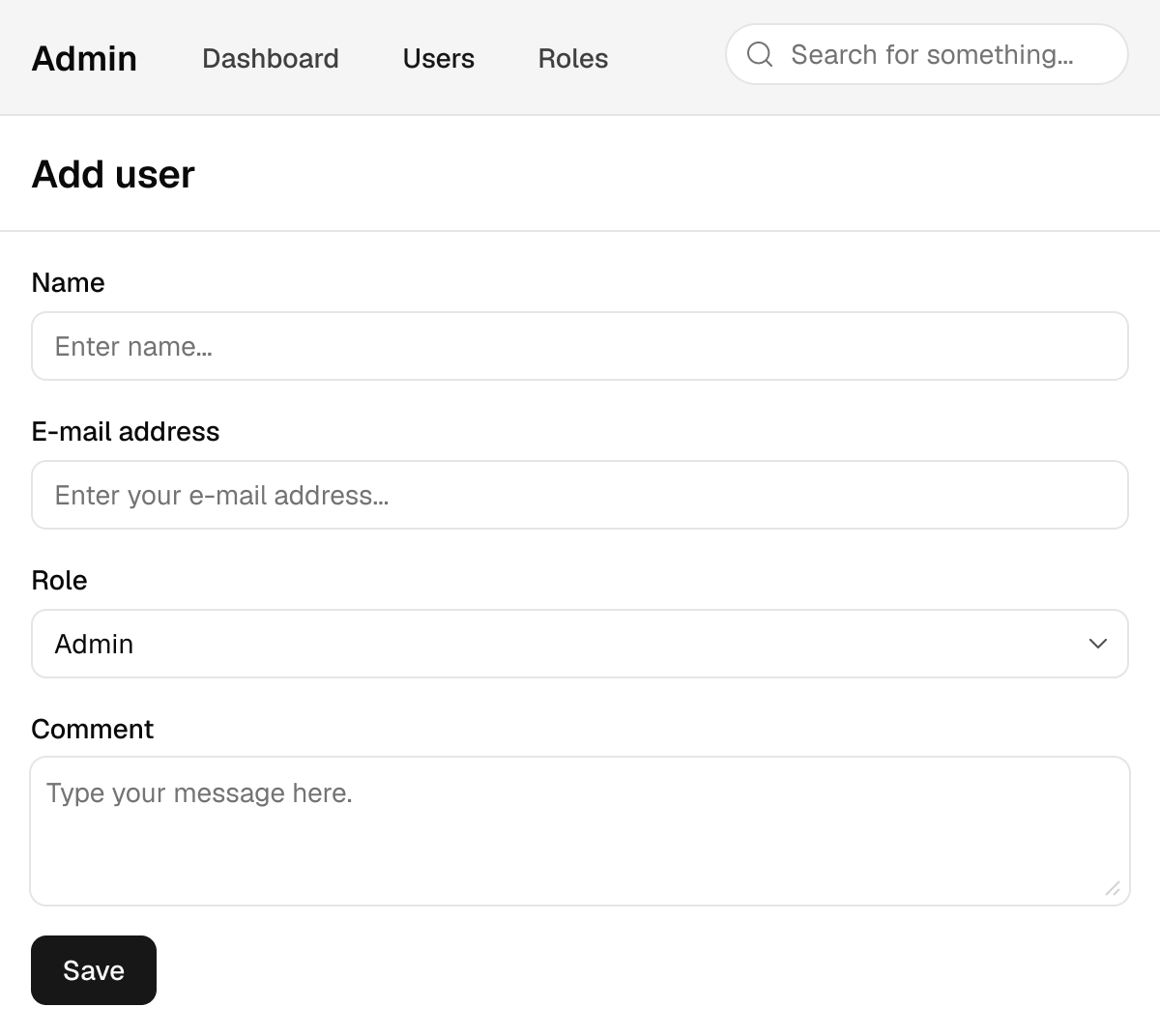
There is no reason why you would have to choose between one or the other. Consider this little user interface, where we have 2 styles used, in a way that makes sense: the search input has distinct round styling, and the main form has regular corners.
All in all, our approach when to having to choose between 2 options is like the meme with the little girl: “why not both”?
Design is about exploring options, not being locked into a choice from the start.